
Case Study Overview
Beanaru
THE CHALLENGE
Beanaru is a coffee brand founded in Australia with roots in Chikkamagaluru, the birthplace of Indian coffee. Built around the ritual of South Indian filter coffee, the brand imports beans directly from the region and introduces the tradition to a new audience through curated products and brewing kits.
The challenge was to create a brand and packaging system that could bridge two worlds. The brand needed to honour the cultural heritage of South Indian filter coffee while presenting it in a way that resonates with Australia’s sophisticated specialty coffee culture.
Beanaru is not only about coffee. It is about ritual. The brand needed to communicate authenticity, craft, and cultural depth while maintaining a refined and minimal aesthetic suited to a premium audience.
Our task was to create a brand world that feels both rooted and contemporary. Something that feels familiar to people who grew up with this coffee tradition while inviting a new audience to discover it.
THE CONCEPT
The concept for Beanaru centers on the idea that timeless tradition meets present rituals.
South Indian filter coffee is defined by its distinctive brewing process, where stacked metal components slowly extract a rich and aromatic brew. This layered system inspired the graphic language of the brand, where forms and elements convey the structure of the brewing kit itself.
Mid-century modern design became the inspiration through which this heritage was reinterpreted. Arched shapes and layered forms reference the geometry of the filter while creating a calm and contemporary composition.
A warm palette of earthy spice tones reflects the richness of coffee and the landscape of Chikkamagaluru.
Brass foil accents recall the traditional brass filters and cups used in the ritual, connecting the packaging to the cultural origins of the drink.
The result is a design language that feels both familiar and modern, conveying a luxurious yet warm feel.


THE SOLUTION
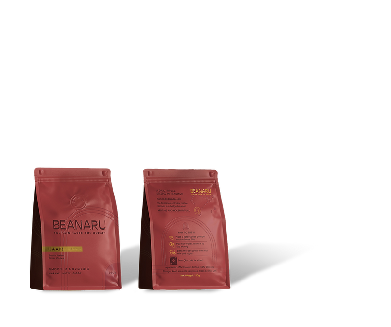
We developed a complete brand identity and packaging system that translates the ritual of South Indian filter coffee into a refined experience.
The identity combines wide custom serif typography with layered arch symbols inspired by the coffee filter. These forms appear across the packaging as stacked and nested shapes, creating rhythm and structure while maintaining a calm and minimal aesthetic.
For the packaging, a soft-touch pouch was paired with delicate UV spot line work and matte brass foil outlines, adding a tactile dimension that mirrors the sensory nature of coffee rituals. Embossed and debossed elements further enhance the premium feel of the product.
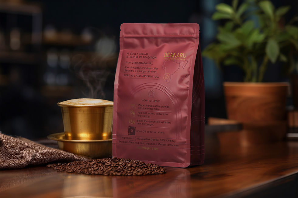
The back of the packaging balances storytelling and functionality. The origin story of Beanaru and the heritage of Chikkamagaluru are presented alongside clear brewing instructions supported by custom icons.
The shipping box carries the same visual language in a simplified way, creating a cohesive unboxing experience that feels intentional and gift-worthy while allowing the product itself to remain the hero. The box can be used for both shipping and gifting. For shipping, we allowed space for the label to be applied while maintaining brand recognition throughout the journey.


KEY TAKEAWAYS

Cultural Storytelling
The brand communicates the heritage of South Indian filter coffee while presenting it through a modern design language that feels relevant to a global audience.
Ritual as Design Inspiration
The supporting graphics are inspired directly by the structure of the traditional coffee filter, translating the brewing ritual into shapes and layers across the packaging.

Minimalism with Meaning
Every visual element connects back to the coffee ritual, from the arch symbol inspired by the brewing kit to the brass foil that references traditional coffee equipment.

Sensorial Packaging
Soft-touch materials, brass foil, UV spot details, and embossing introduce a tactile dimension that reinforces the premium experience.

Clear Product Communication
Custom icons and structured information hierarchy ensure that brewing instructions and product details remain clear and accessible.
A System Built to Expand
The packaging system creates a flexible foundation for future Beanaru products, from additional coffee blends to accessories and café experiences.


